Landing Page Conversion Rate: The Complete CRO Guide 2026
A high-performing landing page converts 2 to 6% of visitors depending on the industry, according to Unbounce's Conversion Benchmark Report. The biggest levers: a value proposition understood in 5 seconds, a single CTA, social proof, a form of 3 fields at most and a load time under 2.5 seconds. The CRO method for SMEs fits in 6 steps: measure in GA4, prioritize, form a hypothesis, test, iterate.

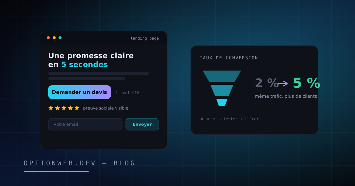
A landing page that converts rests on five pillars: a value proposition understood in 5 seconds, a single call to action, visible social proof, a form stripped to the bare minimum and a load time under 2.5 seconds. According to Unbounce's Conversion Benchmark Report, the median landing page conversion rate sits between 2 and 6% depending on the industry. Most Belgian SMEs can double their current rate by fixing three or four structural mistakes, without spending an extra euro on advertising.
This guide covers the whole subject: the exact definition of a landing page, conversion benchmarks by industry, the anatomy of a high-performing page section by section, the measured impact of speed, form optimization, a 6-step CRO method built for SMEs, and the most common mistakes with their fix. Julien Daniel, founder of OptionWeb, applies this approach to the conversion pages the agency delivers from Châtelet, in Hainaut.
1. What is a landing page and how does it differ from a homepage?
A landing page is a standalone web page designed for a single action: getting a quote request, capturing an email, booking a call. A homepage, by contrast, is a crossroads: it introduces the company and routes visitors to several sections. A landing page deliberately removes those choices to focus attention on one single conversion.
This difference is not cosmetic, it is structural. Sending paid traffic to a homepage means paying for visitors who scatter across the menu. A dedicated landing page extends the promise of the ad: same message, same offer, same vocabulary. This principle is called “message match”, and it directly conditions your conversion rate.
| Criterion | Homepage | Landing page |
|---|---|---|
| Goal | Introduce and route | A single conversion |
| Navigation | Full menu, rich footer | Reduced or absent |
| Number of CTAs | Several (services, contact, blog) | One, repeated |
| Traffic source | SEO, direct visits, brand awareness | Advertising, email, campaigns |
| Message | Generalist, the full offer | Aligned with one specific promise |
| Success metric | Overall engagement | Conversion rate |
The sales page is a close cousin: longer, it sells a product directly instead of capturing a contact. The principles in this guide apply to both formats. For the specific conversion mechanics of an online store (product pages, checkout funnel, payment), see our guide to building an e-commerce website in Belgium, which covers that subject in depth.
2. What conversion rate should you aim for in 2026?
A conversion rate of 2 to 3% is average, 4 to 6% is good, and above 8% you are in the top tier. WordStream data puts the landing page average at around 2.35%, while the top quartile of advertisers exceeds 5.3%. Unbounce's Conversion Benchmark Report confirms these orders of magnitude, with strong variations across industries.
The conversion rate is simple to calculate: number of conversions divided by number of visitors, multiplied by 100. A page that receives 1,000 visitors and generates 40 quote requests converts at 4%. The benchmarks below give cautious reference points by industry, to be read as orders of magnitude rather than absolute targets: traffic source, offer price and audience maturity weigh as much as the industry itself.
| Industry | Observed median | Realistic target (good level) |
|---|---|---|
| B2B services | 2 to 3% | 5% |
| SaaS / software | 3% | 6% |
| E-commerce (lead capture) | 3 to 5% | 7% |
| Finance / insurance | 5 to 6% | 8% |
| Health / wellness | 3 to 4% | 6% |
| Real estate | 2 to 3% | 5% |
| Training / education | 5 to 6% | 8% |
| Tradespeople / local services | 4 to 6% | 9% |
The most useful benchmark remains your own history. Going from 2% to 3% conversion means 50% more leads on the same advertising budget. That is the whole point of CRO (Conversion Rate Optimization): every point gained mechanically lowers your acquisition cost, whereas increasing ad spend gets more and more expensive.
3. What is the anatomy of a landing page that converts?
A high-performing landing page follows a proven structure: a hero that delivers the value proposition in 5 seconds, concrete benefits rather than technical features, social proof, a single repeated CTA, and the methodical removal of every point of friction. The order of the sections follows the visitor's mental journey: understand, believe, act.
Each element below has a specific role. A page can convert without one or another of them, but every omission costs conversion points. Here are the nine components, in the order the visitor encounters them.
- The hero: headline + subheadline + CTA above the fold — The headline states the main benefit, not the product name. The subheadline clarifies for whom and how. Within 5 seconds, the visitor must be able to answer three questions: what is this, what do I get out of it, what should I do. If a stranger cannot rephrase your offer after 5 seconds, the hero needs a rewrite.
- The value proposition: specific and verifiable — “Custom business website from €2,890 excl. VAT, delivered in 3 to 6 weeks” converts better than “Innovative digital solutions”. Numbers, timelines, prices: specificity builds credibility. Marketing jargon builds distrust.
- Benefits before features — A feature describes the product (“NVMe SSD hosting”), a benefit describes the customer's life (“your site loads in under a second, your visitors stay”). List 3 to 5 benefits, each backed by the feature that makes it credible. The benefit sells, the feature proves.
- Social proof: testimonials, logos, numbers — One testimonial with a full name, company and photo is worth ten anonymous quotes. Client logos, the number of projects delivered, a Google rating with its review count: every verifiable element reduces perceived risk. Place social proof near the CTA, at the exact moment doubt kicks in.
- A single CTA, repeated, phrased as a benefit — One goal per page, therefore one CTA, repeated 2 to 3 times depending on length. “Get my quote within 24 hours” outperforms “Submit”: the button describes what the visitor gets, not what they do. Contrasting color, generous size, action verb.
- Friction reduction: anticipating objections — Every unaddressed hesitation is an exit. “No commitment”, “reply within 24 hours”, “GDPR-compliant data, hosted in Europe”: these micro-reassurances placed under the CTA remove objections at the very moment they arise. A mini FAQ at the bottom of the page catches the last pockets of resistance.
- Honest urgency, never manufactured — “3 project slots available this quarter” works if it is true. A countdown that resets on every visit destroys trust, and trust is the main asset of a conversion page. If you have no real scarcity, do not invent one: clarity is enough.
- Visuals that show, not decorate — A product screenshot, a real photo of the team or of the result beats any stock image. Generic visuals (handshakes, skyscrapers) are ignored by the eye and erode credibility. Every image must answer a question the visitor is asking.
- Removing the exits — No full menu, no links to the blog, no social media carousel. Every outbound link is an open door to abandonment. Keep at most a clickable logo and the legal notices in the footer, nothing else.
Once the lead is captured, the real work begins: most prospects are not ready to buy immediately. That is the role of email nurture sequences, which we detail in our email marketing guide for SMEs (Brevo, Mailchimp, Loops, Resend). The landing page captures, email converts over time.
4. Why does loading speed decide your conversions?
Speed is a measured conversion factor, not a technical nicety. Deloitte's “Milliseconds Make Millions” study showed that a mere 0.1-second improvement in mobile load time increased retail conversions by around 8%. Conversely, Google data shows that the probability of a bounce increases by 32% when load time goes from 1 to 3 seconds.
In practice, a landing page should target an LCP (Largest Contentful Paint) under 2.5 seconds on mobile, Google's “good” threshold for Core Web Vitals. The main speed killers are well known: uncompressed images, stacked tracking scripts, heavy page builders, overloaded shared hosting. A static page served from European NVMe SSD hosting, as OptionWeb offers between €9.99 and €19.99/month, generally loads in under a second.
The landing page builder paradox deserves a mention: some tools dedicated to conversion generate pages weighing several megabytes, loaded with scripts. Always test your page in PageSpeed Insights before launching a campaign. Paying for ad traffic to a slow page means funding abandonment.
Mobile-first: designing for the thumb
Most paid traffic now arrives on mobile, particularly from social networks. A landing page should therefore be designed first for a 6-inch screen: a headline readable without zooming, a CTA reachable with the thumb, a form usable with one hand, and a keyboard adapted to each field (numeric for the phone number, email for the email address).
Check three things on your own phone: is the CTA visible without scrolling? Can the form be completed in under a minute? Does nothing overlap? For local services, a direct call button (“Call us: +32 491 14 01 01”) often converts better than a form on mobile: the mobile visitor wants an immediate action.
5. How do you optimize your forms to generate more leads?
The rule is simple: fewer fields, more leads. HubSpot's analyses of thousands of forms show that short forms, around 3 fields, achieve the best submission rates, and that every superfluous field drags conversions down. Ask only for what you need for the first contact: the rest can be collected during the conversation.
An effective quote form fits in three fields: name, email, description of the need. The phone number can stay optional, and the “company” field can often be inferred from a business email address. Every additional field must answer the question: “Is this information essential before the first contact?” If the answer is no, remove it.
- 3 fields maximum for a first contact — Name, email, message. Any further qualification (budget, timeline, company size) happens over the phone or in a second form, once the relationship has started.
- Visible labels, not just placeholders — A placeholder that disappears as you type forces the visitor to remember what was being asked. A label above the field stays readable at all times and also improves accessibility.
- Immediate, specific error messages — Validate field by field, not at submission. “This email address looks incomplete” under the relevant field avoids the rage-quit that follows a wholesale rejection of the form.
- A benefit-driven button, reassurance below it — “Get my free quote within 24 hours” as the button, “No commitment — your data stays in Europe (GDPR)” just below. The moment of the click is the peak of hesitation: that is exactly where the reassurance has to be.
- A thank-you page that extends the conversion — After submission, do not leave a bare “Thank you”. Announce what happens next (“Julien will get back to you within 24 hours”) and offer a secondary action: read a client case study, book a call slot directly.
Mind the GDPR: a capture form must clearly state how the data will be used and must not pre-tick the newsletter opt-in. Consent is given, not assumed. A separate, unticked checkbox for emailing is the norm in Belgium as across the whole European Union.
6. What simple CRO method can an SME apply?
CRO requires neither a data team nor expensive tools: the method fits in 6 steps, with GA4 (free) as the measurement backbone. The principle: never change a page on a hunch — measure, form a hypothesis, test one variable at a time, and keep what wins. One cycle per month is enough to make lasting progress.
- Measure the current situation: set up a conversion event in GA4 (form submission, click on the call button). Record your baseline conversion rate over 30 days, by traffic source and by device. Without this baseline, there is no way to know whether a change improves anything at all.
- Identify the weak link: compare the steps. Plenty of visitors but little scrolling? Hero problem. Scrolling but few clicks on the CTA? Offer or proof problem. Clicks but few submissions? Form problem. GA4 reports and a free heatmap tool (Microsoft Clarity) pinpoint the leak.
- Form a precise hypothesis: “If I replace the generic headline with the quantified benefit, then the click-through rate on the CTA will increase, because the value proposition will be understood faster.” One hypothesis = one change + one expected effect + one reason.
- Test a single variable: change the headline OR the CTA OR the form, never all three at once. With fewer than 1,000 visitors/month, a formal A/B test lacks statistical power: run a sequential test instead (30 days before / 30 days after) while keeping the same traffic sources.
- Decide on the numbers: if the variant clearly wins, adopt it. If the result is ambiguous, treat the test as inconclusive and move on to a bolder hypothesis. A 0.2-point gap over 200 visitors proves nothing.
- Iterate and document: log every test (hypothesis, dates, result) in a simple spreadsheet. After six months, this log becomes your best marketing asset: it tells you what makes your customers act, not the customers in American case studies.
Prioritize the tests with the highest potential impact: the hero headline, the offer itself (free quote vs complimentary audit), the CTA and the form. Testing a button color on a page whose headline is unclear is repainting a door that opens onto nothing. The big wins almost always come from the message, rarely from the cosmetics.
On an OptionWeb site, every landing page delivered includes GA4 setup and conversion events: measurement is part of the delivery, not an extra. That is what allows CRO to start from day one.
7. Which mistakes kill a landing page's conversion rate?
The mistakes that cost the most conversions are rarely technical: they are mistakes of message and structure. Multiple CTAs scattering attention, jargon obscuring the offer, a total absence of social proof, aggressive popups interrupting the reading. The table below lists the most common ones, their impact and the fix to apply.
| Mistake | Impact on conversion | Fix |
|---|---|---|
| Several competing CTAs (quote + newsletter + callback + brochure) | Choice paralysis, scattered clicks | One goal, one CTA, repeated. Secondary actions disappear or move to the thank-you page |
| Jargon-heavy headline (“360° digital solutions”) | The visitor does not understand the offer and leaves within 5 seconds | Concrete benefit + number: “Your custom business website from €2,890, delivered in 3 to 6 weeks” |
| No social proof at all | Maximum perceived risk, especially for a first purchase | 2-3 named testimonials, client logos, Google rating with review count, near the CTA |
| Popup on page arrival | Interruption before the offer is even read, immediate bounce | Remove it, or trigger it only on exit intent on desktop |
| 8-field form | Every superfluous field drives away qualified leads | Cut down to 3 fields, qualify over the phone |
| Slow page (> 4 s on mobile) | Bounce before anything renders, wasted ad budget | Compress images, trim scripts, static page on fast hosting |
| Full navigation menu | Exits to the blog, social networks, the team page | Remove the menu, keep the logo and legal notices |
| Manufactured urgency (fake countdown) | Permanent loss of trust once the trick is spotted | Real urgency only, or clarity without urgency |
One last mistake deserves a mention: treating the landing page as a finished project. A conversion page is a living asset. Offers evolve, prices change, testimonials age. A 30-minute quarterly review (GA4 numbers, content freshness, form testing) is enough to maintain performance.
In short: a landing page that converts is a page that clearly says one thing, proves it, and makes the action obvious. Benchmarks give you a bearing (2 to 6% depending on the industry), the structure gives you the method, and the monthly CRO cycle turns the page into a machine for improvement. None of this requires a big budget: it requires discipline.
OptionWeb has been building custom, fast, measurable landing pages since 2014: a value proposition crafted with you, a static Next.js page that loads in under a second, GA4 configured, GDPR-compliant European hosting. Quote within 24 hours via contact@optionweb.dev or on +32 491 14 01 01. Meetings available in Charleroi, Namur, Liège, Mons and Bruxelles, or by video call.
Read next
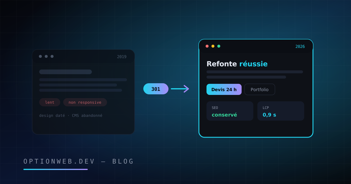
Website Redesign Without Losing SEO: The 2026 Guide
Website redesign in 2026: warning signs, an 8-step SEO-safe method, costly mistakes, budgets and timeline. Rebuild your site without losing your SEO.
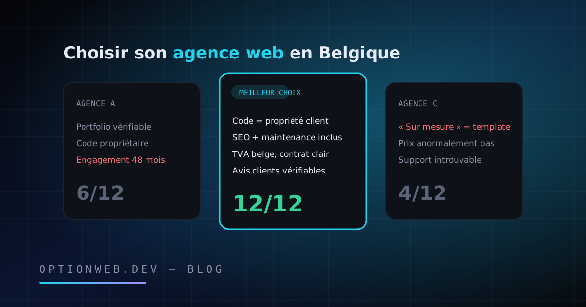
How to Choose a Web Agency in Belgium: 12 Criteria for 2026
How to choose a web agency in Belgium in 2026? 12 concrete criteria, red flags, questions to ask at the first meeting and a ready-to-use scoring grid.
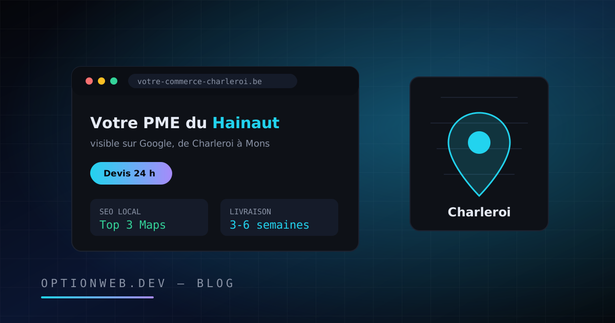
Website Creation in Charleroi & Hainaut: 2026 Local Guide
Website creation in Charleroi and Hainaut: realistic 2026 prices, project steps and local SEO, from a web agency based in Châtelet since 2014.